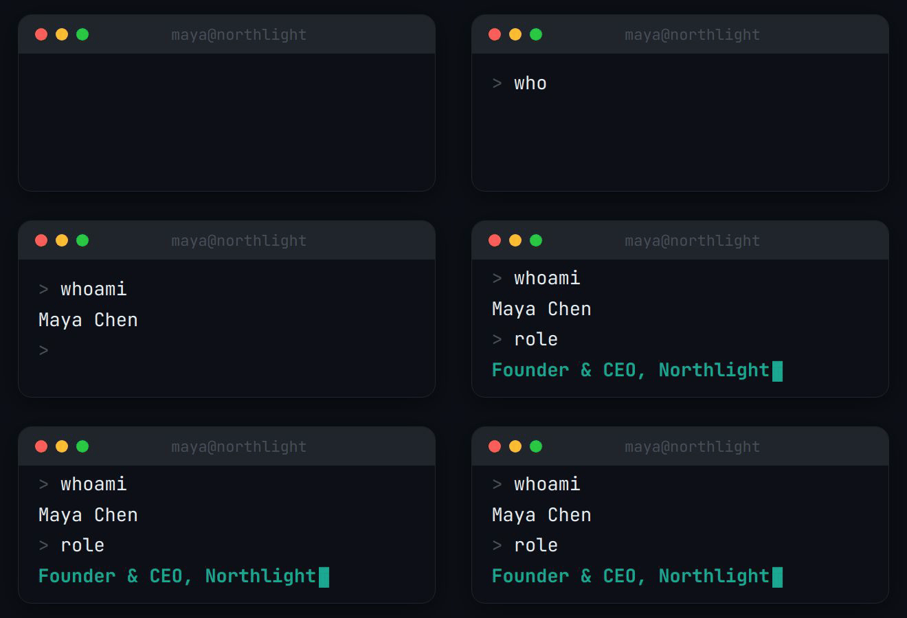
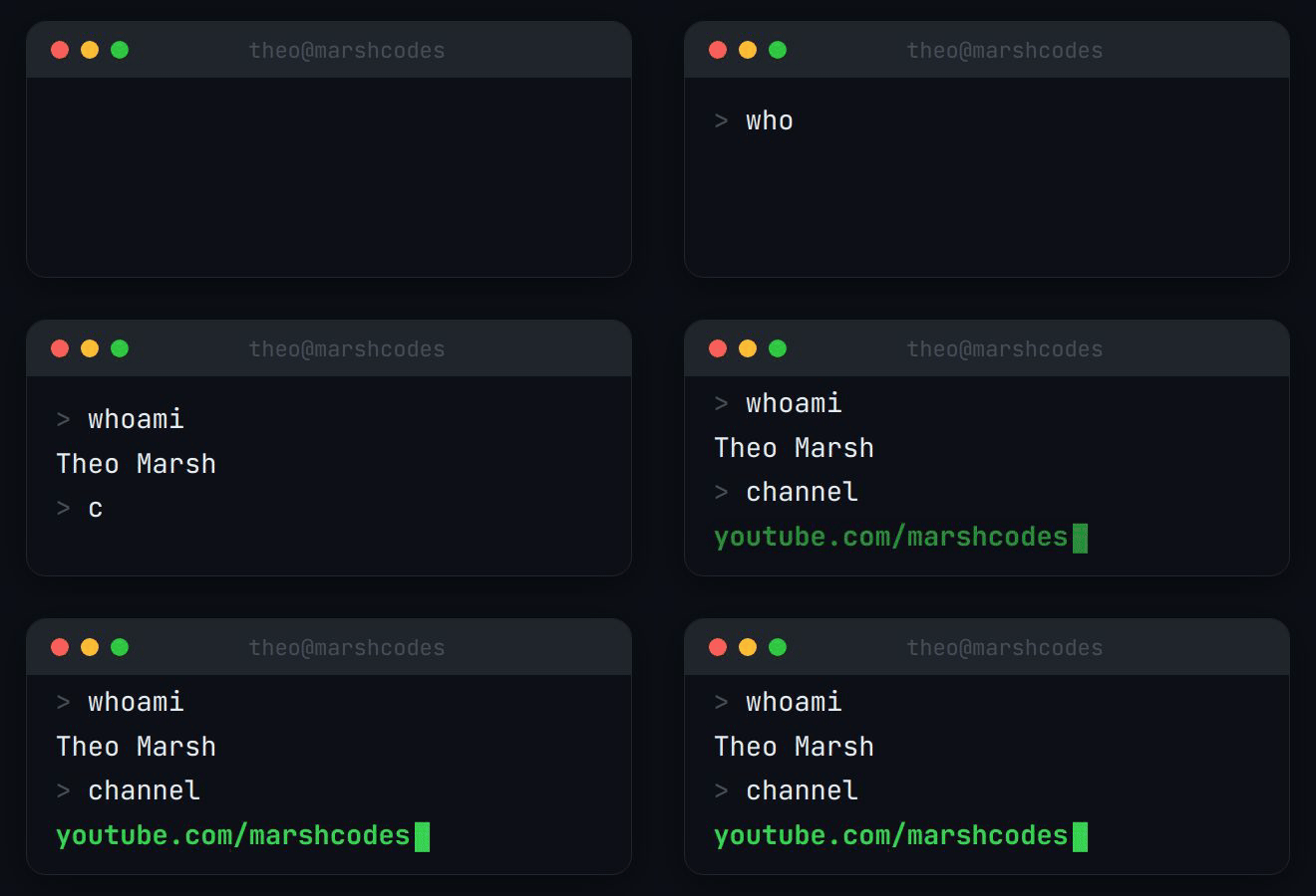
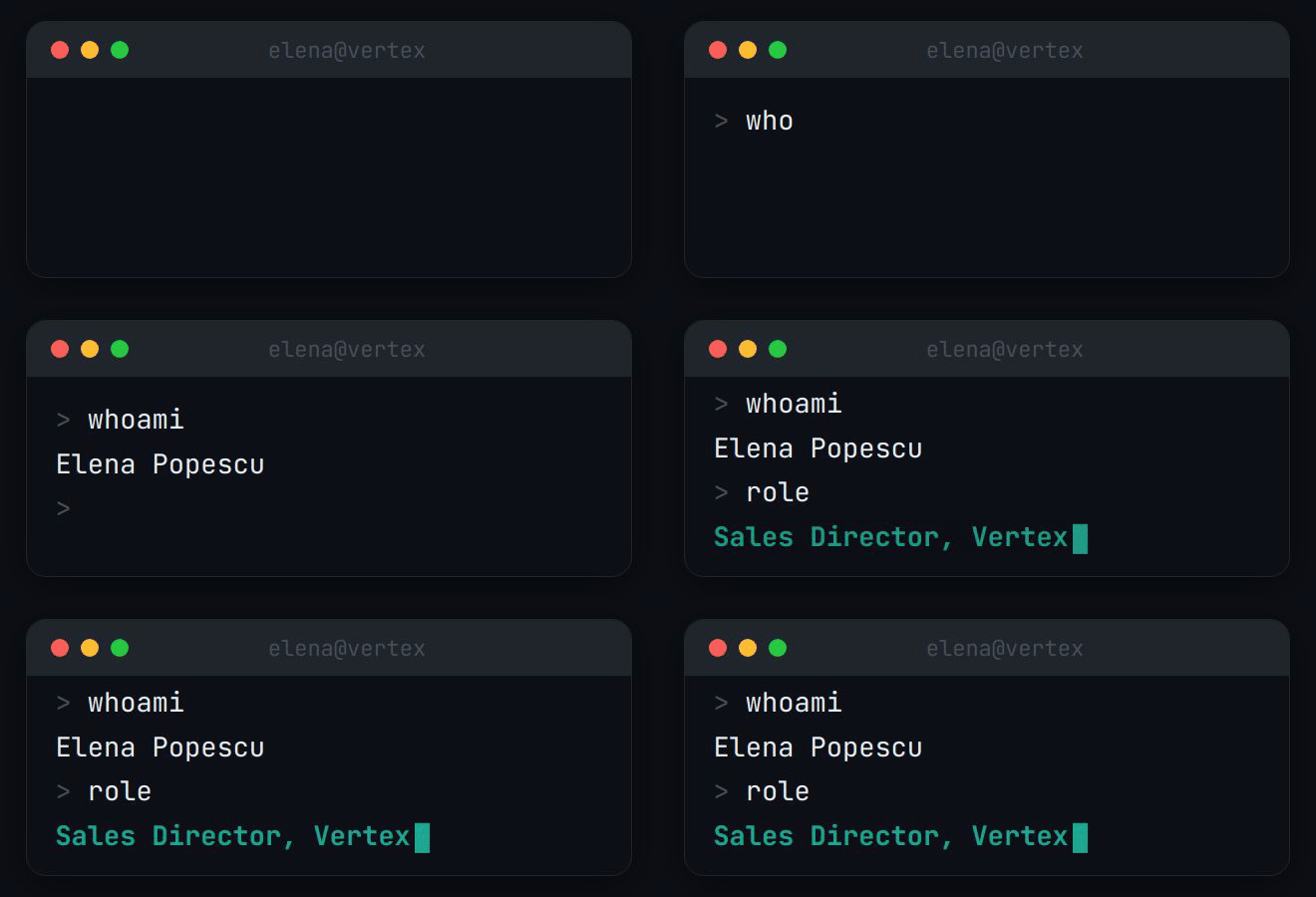
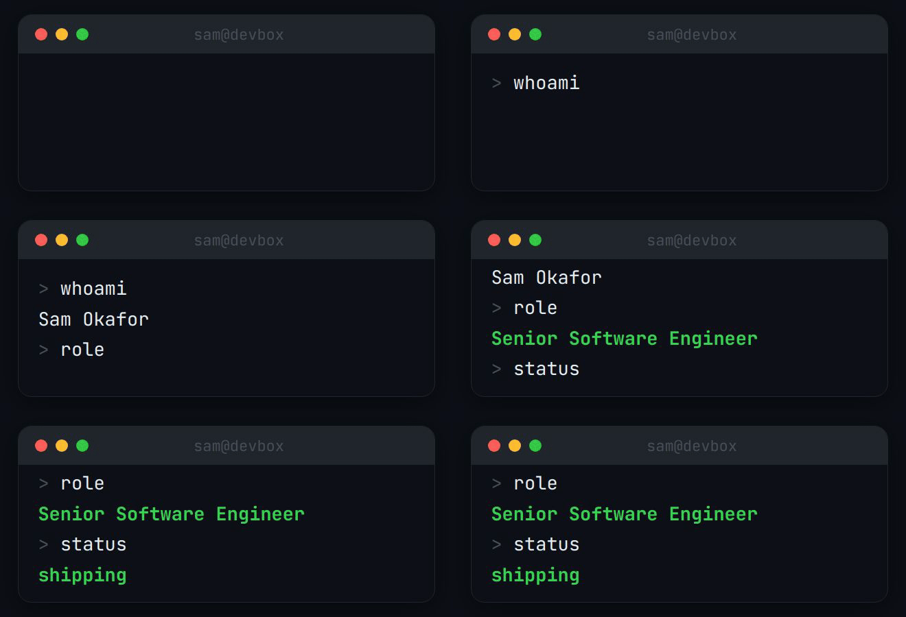
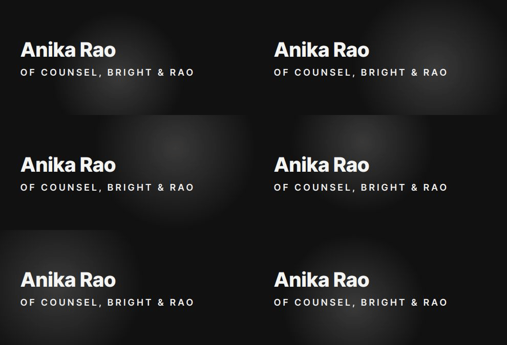
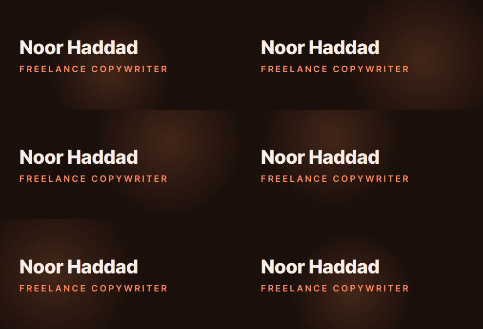
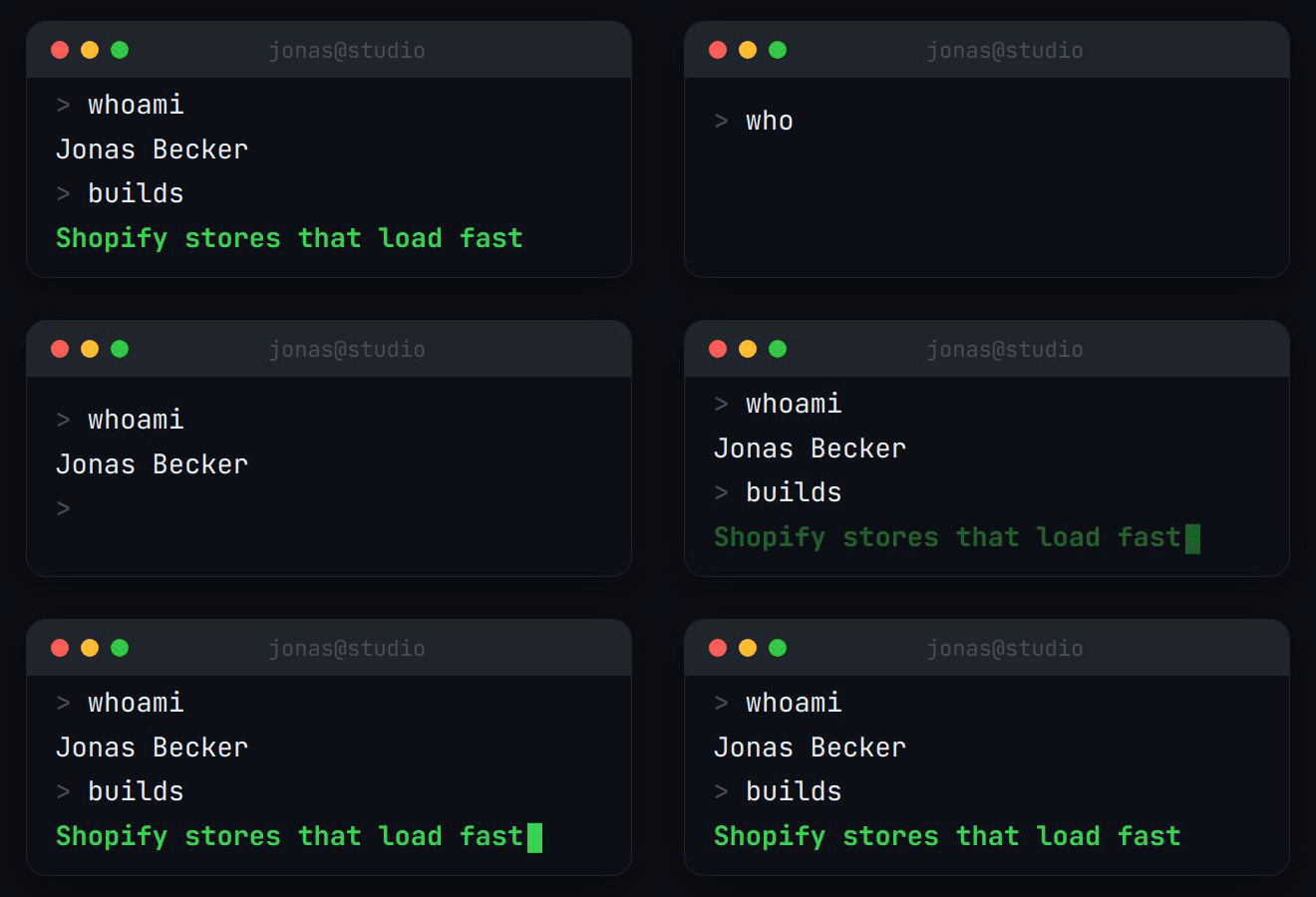
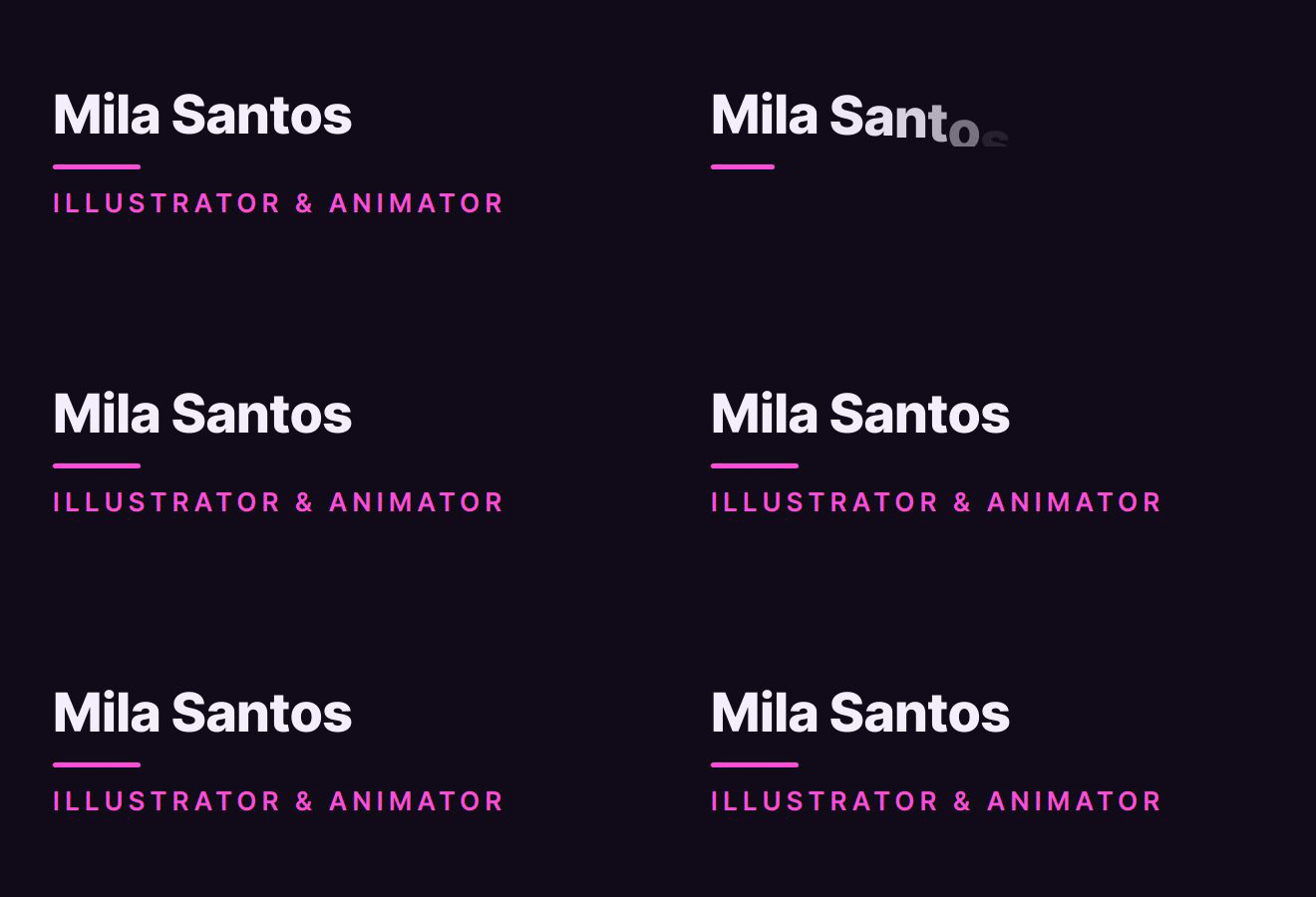
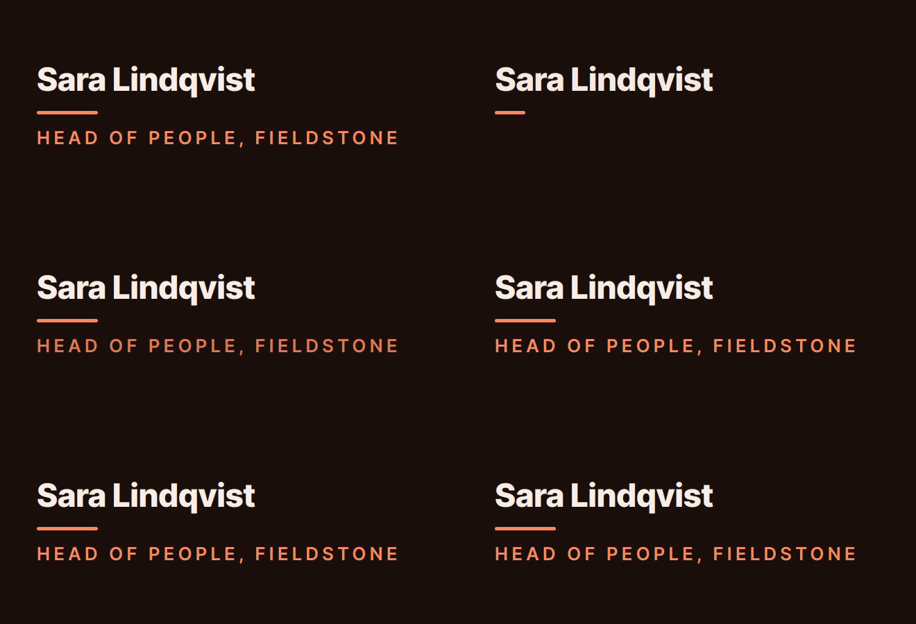
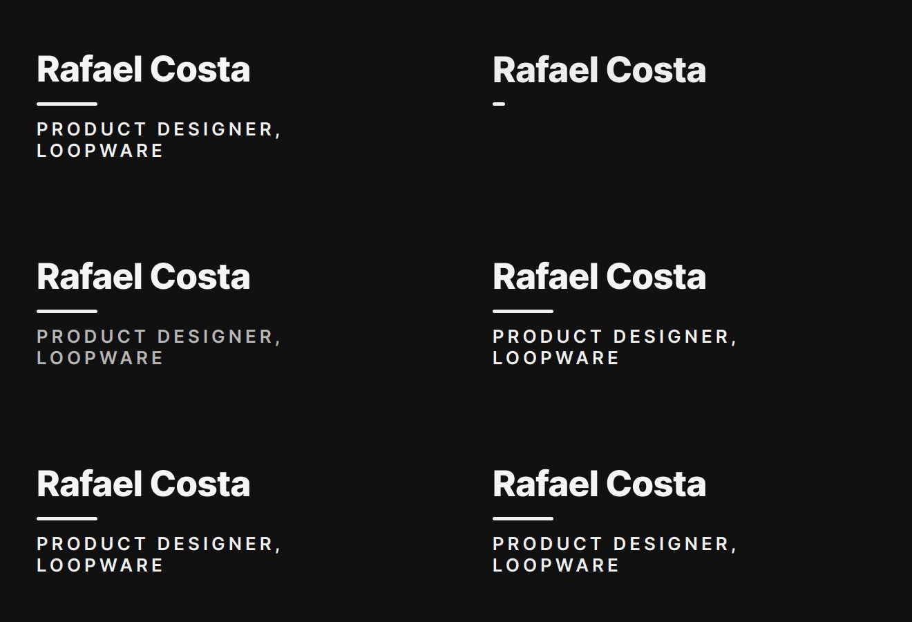
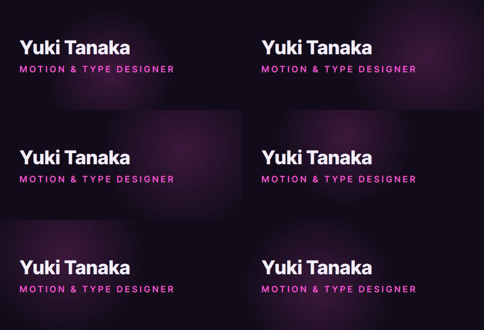
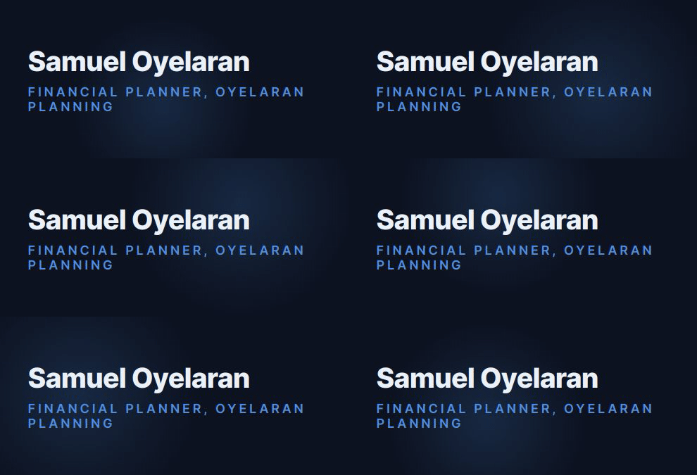
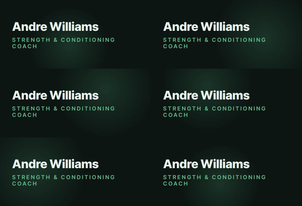
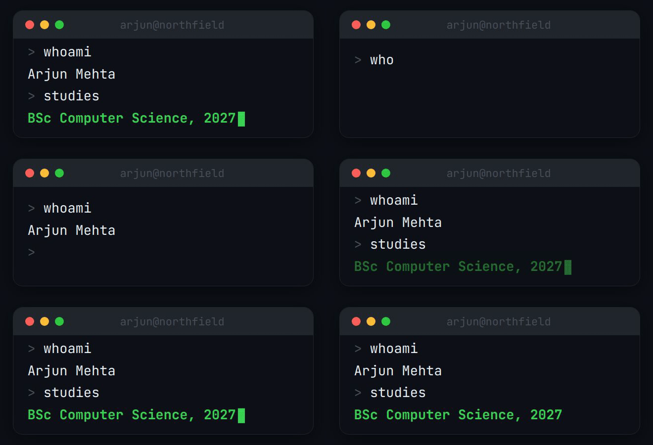
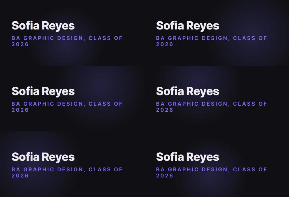
A signature has one job: tell the reader who you are and how to reach you, in the time it takes to glance at it. The examples above differ in colour and motion, but they share the same structure.
A clear hierarchy. Your name is the largest thing. Role and company come second. Everything else is smaller.
Three or four lines. If it is taller than the email above it, it is too long.
Real text links. Your email and profile links are ordinary links outside the image, so they still work when images are blocked.
Motion that ends. An animation that plays and settles looks designed. One that loops forever looks like an advert.
One accent colour. Taken from your brand if you have one.
Readable in dark mode. Each design carries its own background, so it does not turn into dark text on a dark inbox.
Questions
What should a professional email signature include?
Your name, your role, your company or organisation, and one or two ways to reach you. Add a link to the profile or site where people can check who you are. Most good signatures are three or four lines.
What should I leave out of an email signature?
Quotes, long legal text set in the same size as your name, more than three social icons, several phone numbers, and images that carry all the information. If images are blocked, an image-only signature shows nothing.
Are these examples templates I can copy?
They are real output from BylineSig, shown with example names. Choose one, enter your own details and you get your own version, redesigned around how you describe yourself rather than filled into a fixed template.
Do animated signatures work in every email client?
The animation is a GIF, which Gmail, Apple Mail and current versions of Outlook display. Outlook 2019 and earlier show the first frame only, so each design is built to start on a complete, readable frame.